Mixed foundations
Raw values, semantic roles, and component decisions were mixed. Names described appearance, not purpose, making reuse difficult and change risky.
I led the audit and design of foundations, tokens, components, documentation, and migration.
The system no longer supported current work. Designers and developers bypassed it because local components and overrides were faster.
I rebuilt the connected layers: foundations, tokens, themes, components, library structure, documentation, contribution rules, and Figma-to-code links.
Raw values, semantic roles, and component decisions were mixed. Names described appearance, not purpose, making reuse difficult and change risky.
Similar controls had different properties, states, and structures. Logic lived in one person’s head, with no rules for components, themes, or local solutions.
Designers recreated patterns, while developers received similar designs implemented differently. Without shared rules and documented ownership, the library became difficult to maintain and scale.
Colours were stored directly alongside components in a single Figma file. All values lived in a single flat layer. Raw values, semantic roles, themes, and component-specific decisions were mixed together, making updates difficult and inconsistent.
The new model separates primitives, semantic tokens, component tokens, and aliases. Primitives store base values, semantic tokens define interface roles, component tokens map them to specific UI elements, and aliases resolve values by platform, mode, theme, state, and density.
The system was extended beyond colour to typography, dimensions, spacing, sizing, grids, radii, borders, elevation, blur, and icons. A separate component-token layer maps foundation values to specific UI elements.
| Name | light | dark | junior |
|---|---|---|---|
| primaryColor | |||
| primaryLightColor | |||
| primaryDarkColor | |||
| primaryBackground | |||
| secondaryColor | |||
| secondaryLightColor | |||
| secondaryDarkColor | |||
| secondaryBackgroundColor | |||
| successColor | |||
| successLight | |||
| successDark | |||
| successBackgroundColor | |||
| badgeColor | |||
| errorColor | |||
| errorLight | |||
| errorDark | |||
| errorBackgroundColor | |||
| warningColor | |||
| warningLight | |||
| warningDark | |||
| warningBackgroundColor |
| NAME | DEFAULT LIGHT | DEFAULT DARK | JUNIOR | BUSINESS LIGHT | BUSINESS DARK | PREMIUM LIGHT | PREMIUM DARK |
|---|---|---|---|---|---|---|---|
| brand / primary | |||||||
| default | brand/green/500 | brand/green/400 | subBrand/junior/violet/500 | subBrand/business/ocean/500 | subBrand/business/ocean/400 | subBrand/premium/slate/500 | subBrand/premium/slate/500 |
| hover | brand/green/400 | brand/green/300 | subBrand/junior/violet/400 | subBrand/business/ocean/400 | subBrand/business/ocean/300 | subBrand/premium/slate/400 | subBrand/premium/slate/400 |
| pressed | brand/green/600 | brand/green/700 | subBrand/junior/violet/600 | subBrand/business/ocean/600 | subBrand/business/ocean/700 | subBrand/premium/slate/600 | subBrand/premium/slate/700 |
| surface / canvas | |||||||
| default | neutral/gray/50 | neutral/green/950 | subBrand/junior/violet/50 | subBrand/business/blue/50 | subBrand/business/ocean/950 | subBrand/premium/slate/50 | subBrand/premium/slate/950 |
| surface / primary | |||||||
| default | neutral/white/a100 | neutral/green/900 | neutral/white/a100 | neutral/white/a100 | neutral/white/a100 | neutral/white/a100 | subBrand/premium/slate/900 |
| active | brand/green/100 | brand/green/900 | subBrand/junior/violet/100 | subBrand/business/blue/100 | subBrand/business/ocean/800 | subBrand/premium/slate/100 | subBrand/premium/slate/800 |
OKLCH was integrated into the palette-generation process to create more predictable colour scales and maintain consistent lightness and contrast across themes.
Components contained too many nested layers, overrides, and duplicated elements. Even simple edits required navigating complex internal structures, which slowed designers down and made components easy to break.
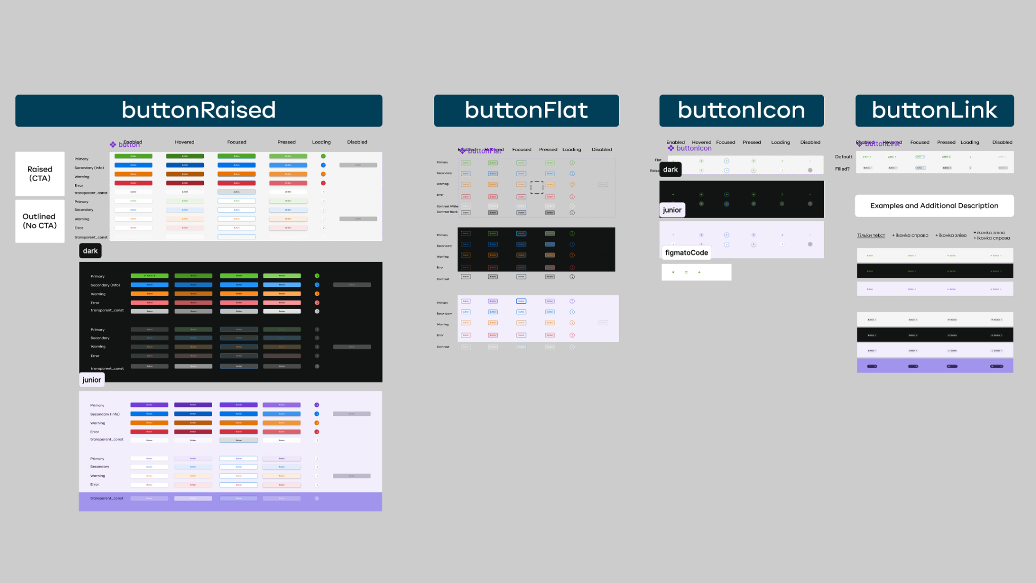
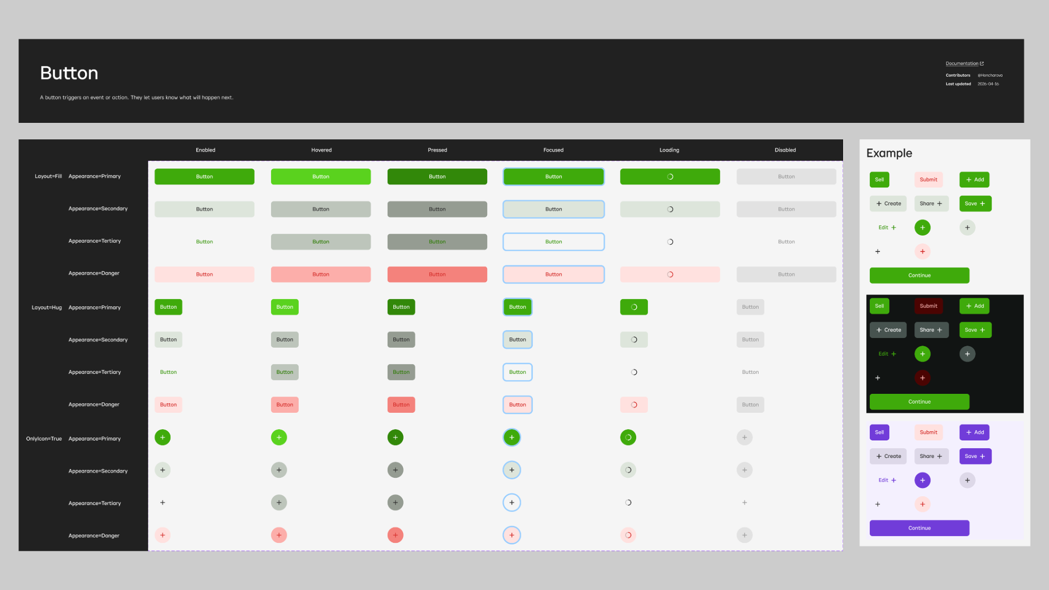
Button replaced separate component families with one property model for layout, appearance, state, and icon-only use. Optional icons remain part of the same component. The model works across themes and platforms.
Usage across product flows was audited, and overlapping or rarely used variants were removed. Four separate button families were consolidated into one Button component. Primary, Secondary, Tertiary, and Danger are now appearance values, while fill, hug, and icon-only layouts remain part of the same model.
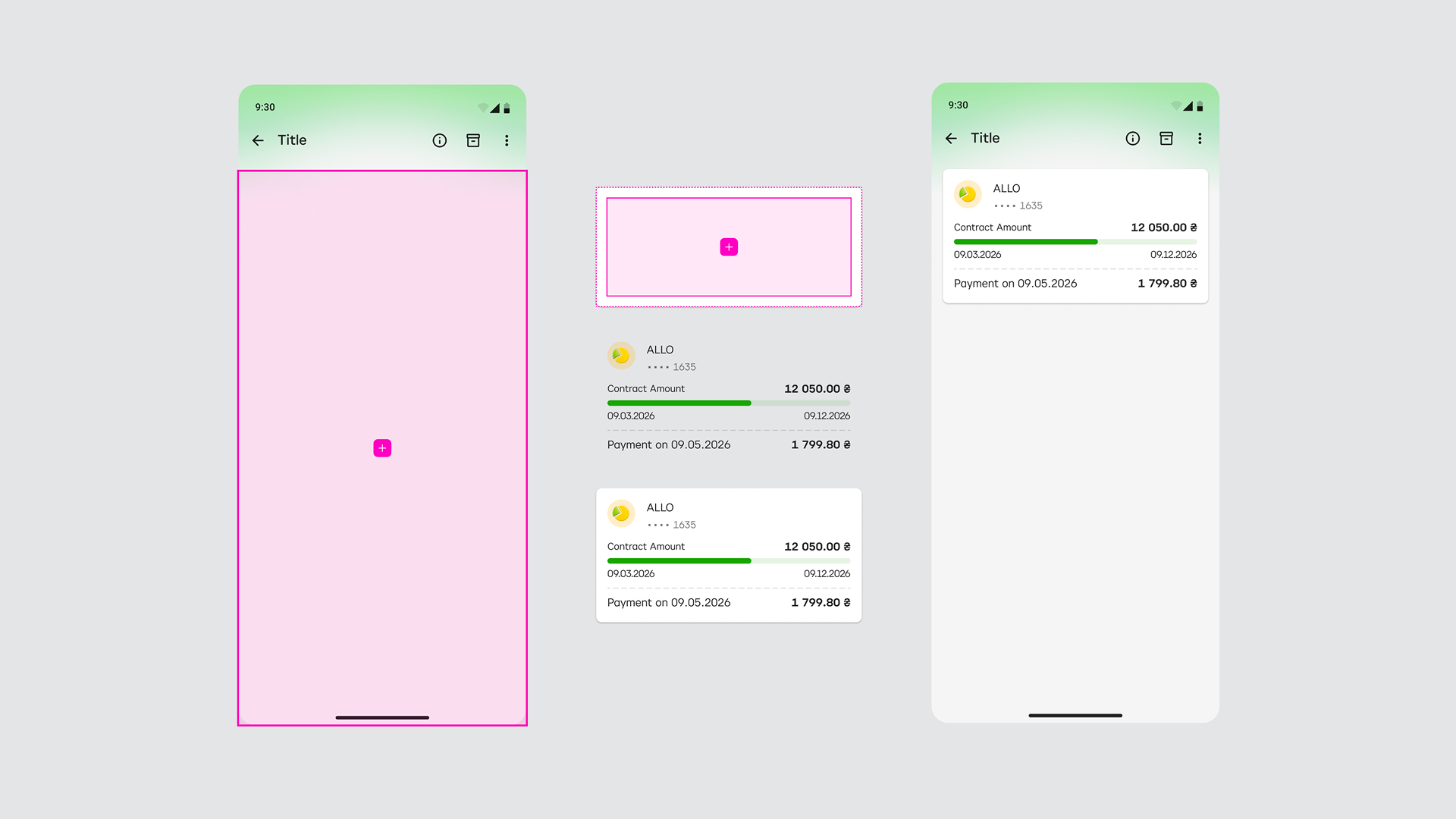
Slots replaced deeply nested content layers. Teams can insert or replace content while the parent component retains spacing, alignment, states, and responsive behaviour.
iOS, Android, and Web share the same component anatomy and property model, while platform-specific behaviour is handled separately.
Figma variables and code tokens were aligned through the same naming model. Aliases and modes handle themes in design, while component properties follow the structure of production components.
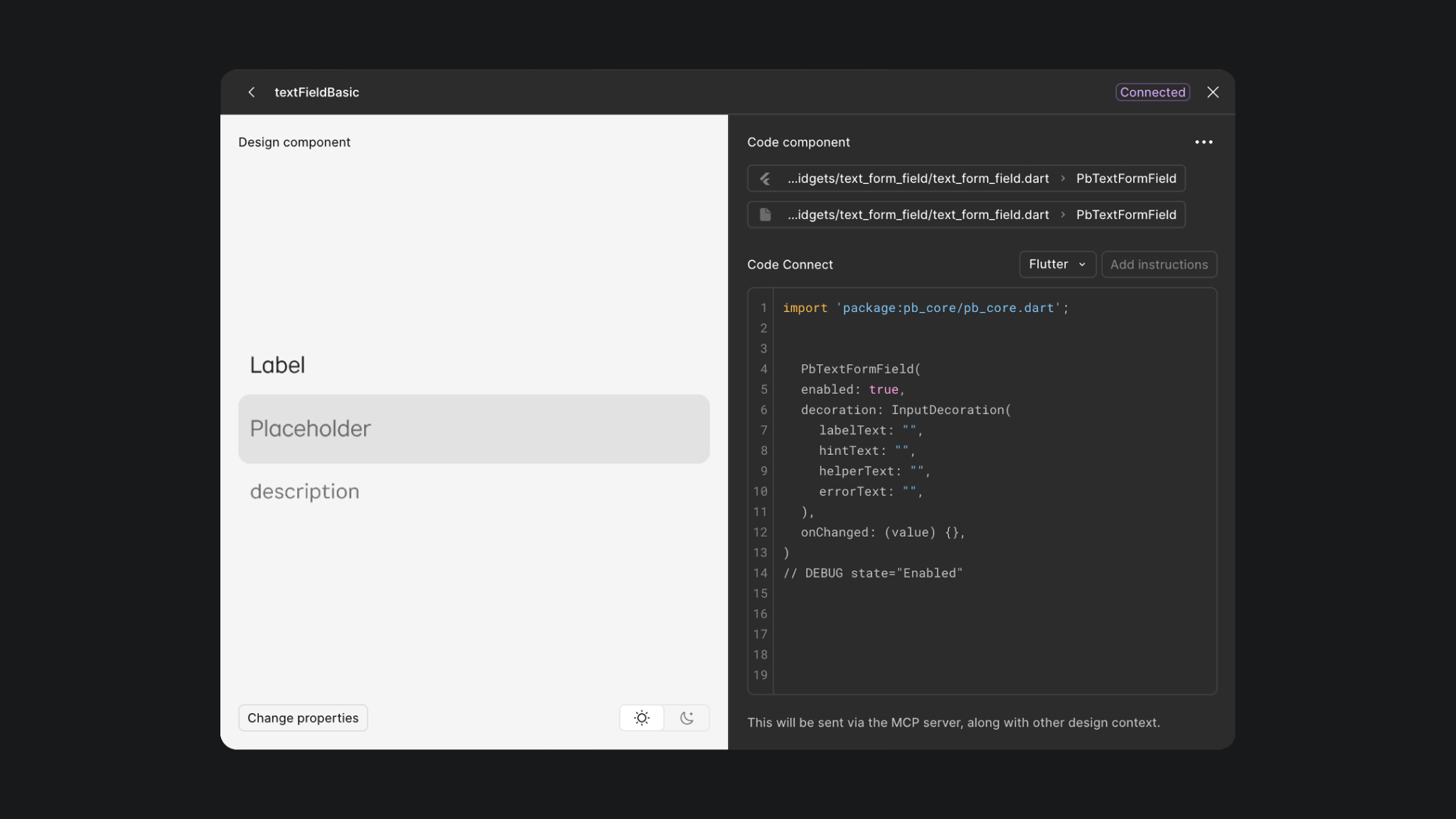
Code Connect links Figma components to their production implementations. Dev Mode shows real component code and maps properties such as variants, text, booleans, nested instances, and slots.
Design and engineering review the same component structure, properties, behaviour, and implementation examples. Documentation focuses on usage rules and exceptions instead of repeating specifications for every screen.
Migration follows the redesign: foundations, core components, composed patterns, then product flows.
Legacy components remain during migration. Deprecations include replacement paths and planned removal, avoiding a forced switch.
Every contribution started with a reuse check, followed by design and engineering review, documentation, and release. Figma branches isolated changes for review before they were merged into the main library. Versioning, release notes, and decision logs kept releases traceable.
Designers could assemble complete product flows several times faster by reusing documented components and patterns instead of rebuilding common structures.
Clear component roles, usage rules, and shared patterns reduced unnecessary invention. Teams made fewer one-off decisions, improving consistency across services.
Shared component contracts and closer Figma-to-code alignment simplified implementation for developers. Design inconsistencies found during design review dropped to near zero.